
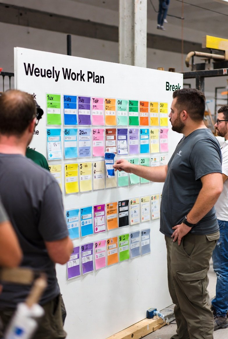
Here's a test I've run on more jobsites than I can count. Pin up a weekly work plan as a spreadsheet — twelve rows of activity names, a "duration" column, a "crew" column — and ask three foremen to tell you what's happening in the north stair on Wednesday. You'll get three different answers and about ninety seconds of squinting. Draw the same week as a grid of colored blocks over a floor plan, and they'll answer before you finish the question.
That's the whole argument, really. Construction happens in space and over time, and a text list captures neither. A plan you have to read line by line isn't a plan the crew carries in their heads. A plan you can see is. Everything below is about why that gap is so wide, and how to build weekly plans that live on the visual side of it.
Why the spreadsheet fails on site
A spreadsheet is a fine place to store data. It's a terrible place to make a decision. The problem isn't the tool — it's that a list forces your brain to do work that a picture does for free.
- You can't see conflicts. Two trades scheduled in the same room on the same day sit fifteen rows apart in a list. Nobody catches it until the electrician and the drywaller are standing in the same eight feet of corridor arguing about who was there first. On a location-based grid, those two blocks land on top of each other and the collision is impossible to miss.
- You can't see the flow. Construction is a sequence moving through space — layout chases framing, rough-in chases layout, close-up chases inspection. A list shows tasks; it hides the parade. You lose the single most important thing about a look-ahead: whether the trades are flowing cleanly through the building or tripping over each other.
- You can't see load. Is Thursday jammed and Monday empty? A list won't tell you without adding up hours in your head. A visual plan shows a wall of blocks stacked on Thursday and daylight on Monday at a glance.
- Nobody gathers around it. This one's underrated. Crews will crowd a board on the wall. They will not crowd a laptop showing a spreadsheet. If the plan doesn't pull people in, it doesn't get discussed, and a weekly work plan that doesn't get discussed is just paperwork.
None of this is a knock on the people reading the list. It's how vision works. We're wired to read a picture in one pass and a list one item at a time. Fighting that on a jobsite, where the guy reading the plan has gloves on and thirty seconds, is a losing game.
What a good visual plan actually shows
A useful weekly work plan encodes three dimensions at once, and it does it with layout so you don't have to decode anything.
- Time runs left to right. Days across the top — Monday through Friday, plus Saturday if you're running it. Everyone already reads a calendar this way, so there's nothing to learn.
- Space or trade runs top to bottom. This is the choice that matters. Organize the rows by location — Level 3 North, Level 3 South, stair core, roof — and the plan reads like a map of who's where. Organize by trade and it reads like a crew roster. Location-based is usually the stronger default for weekly planning because congestion and trade-stacking are location problems. You want to see that four crews are all crammed onto Level 2 while Level 4 sits empty.
- Work shows up as sized blocks. A two-day task is a block twice as wide as a one-day task. Duration becomes something you see, not something you read out of a column. Gaps become visible too — and gaps in a look-ahead are where money leaks out.
Get those three things right and the plan starts doing your job for you. A block that runs off the edge of the week is a task that won't finish — obvious. Two blocks overlapping in one location on one day — obvious. A crew row that's blank all week — obvious, and worth a phone call before Monday.
Color, used on purpose
Color is the fastest channel you've got. Waste it on decoration and it's noise; spend it on one clear job and it does more than a paragraph of notes ever could. Pick one system and hold it for the whole project — the worst thing you can do is change what a color means from week to week.
- Color by trade. Framers blue, electrical yellow, mechanical green, drywall gray. Now the whole parade of trades through the building is legible in one glance, and trade-stacking jumps out as a clump of mismatched colors in one location.
- Color by status. Green for done, yellow for in progress, red for blocked. This turns your plan into a live progress board. Walk the floor Wednesday afternoon, mark reality, and Thursday's stand-up starts from truth instead of optimism.
You can't do both jobs with the same colors on the same view without it turning to mud. Pick trade-color for the planning view and status-color for the tracking view, and keep them as separate lenses on the same week. Any decent look-ahead scheduling tool — this is exactly the kind of thing LookAheadWall is built to toggle — lets you recolor the same plan by trade or by status without rebuilding it.
Trade flow: the part a list can't show at all
This is where visual planning stops being a nicety and becomes the whole point. On a real job the trades don't work in isolation; they move through the building in a connected chain. Overhead rough-in flows into inspection, inspection into insulation, insulation into hang-and-tape, tape into paint, paint into finish flooring. Miss the sequence in one location and you've either got a crew standing around waiting or a crew burying work that isn't inspected yet.
A weekly work plan built as connected trade flows through locations lets you see the handoffs. When electrical rough-in in Level 3 North slips two days, you can watch the ripple travel down the chain — insulation can't start, so drywall can't start, so the whole level shifts right. On a spreadsheet that ripple is invisible until it shows up as a blown milestone three weeks later. On a visual flow it's a conversation you have Monday morning.
Build in your buffers here and make them visible. A day or two between finishing framing and starting rough-in for cleanup and inspection. A buffer before drywall close-up so somebody actually walks the wall — megger the runs, check the blocking, confirm the in-wall inspection is signed — before it disappears behind gypsum. When those buffers are drawn as gaps in the plan rather than assumed in someone's head, nobody schedules over them by accident.
Zones, takt, and seeing work move through the building
Once you're organizing by location, you're one step from real takt planning. Break a floor into zones of roughly equal work content, then run each trade through the zones at a steady beat — Zone A this week, Zone B next, the next trade one zone behind. Drawn out, it makes a clean diagonal staircase of blocks marching across the plan. That diagonal is the tell. When it's crisp, work is flowing. When it breaks — a block sitting two zones back, a trade lapping another — you've found your bottleneck without running a single report.
Overlay the plan on an actual floor plan when you can and the spatial reasoning gets even sharper. "Level 4 corridor, gridlines 5 to 9" means something different to a foreman than "Task 47." One's a place he can walk to; the other's a row number.
Getting the picture into the field
A beautiful plan on the trailer wall that never reaches the crews is half a plan. The visual has to survive the trip to where the work happens.
- Filtering beats zooming. A foreman doesn't need the whole building on his phone — he needs his trade, his zone, this week. Let him strip the plan down to just his rows so the screen isn't a wall of noise. The plan that's readable on a 27-inch monitor is useless on a phone unless he can filter it first.
- Design it to print. Plenty of supers still post the week by the gang box, and they should. If the colors go to gray mush on a black-and-white printout, add patterns or labels so it survives the copier. Legibility at arm's length in bad light is the real spec.
- Always include a legend. Don't assume the new subcontractor's foreman knows blue means framing. A small legend in the corner costs nothing and prevents the confident misread, which is worse than no read at all.
The mobile companion — a crew leader pulling up this week's plan on his phone at 6:30 a.m. instead of waiting for a printout — is where a lot of the value actually lands. The plan is only as good as the last person who sees it before they pick up a tool.
The big-room effect, and why it's real
Put a large visual plan on a screen or a wall and something changes in the weekly meeting. People point. Subs speak up because they can see exactly where their work sits against everyone else's. The plumber notices the framer is a day behind in the same room he's supposed to be in Thursday, and he says so — out loud, in the room, before it's a problem. You cannot get that from twelve people staring at their own copy of a spreadsheet, each reading a different row.
Edit it live while they watch. Drag Thursday's overloaded work into Monday's empty space and let the whole room see the load even out. That single move — visible, collaborative, in the moment — does more for buy-in than any amount of after-the-fact distribution. People commit to a plan they helped shape and could see taking shape.
Physical, digital, or both
Sticky notes on a whiteboard still have a place, and I'd never talk a team out of one for the planning session itself. There's something about physically moving a card that makes people think harder about the commitment behind it. The catch is the wall doesn't travel and it doesn't update — Friday's photo of the board is already wrong by Tuesday.
Digital wins on distribution, versioning, and reach: everyone sees the same current plan, from the field or the office, and last week's snapshot is still there to compare planned against actual. The honest answer for most teams is hybrid — stickies for the live pull-planning session if that's your culture, then a digital plan that everyone works off for the rest of the week. Use each for what it's good at instead of picking a side.
Make constraints impossible to miss
Half of look-ahead planning is clearing constraints before the work is due — the missing submittal, the RFI with no answer, the material that hasn't shipped, the inspection nobody scheduled. Keep that list in text and it dies in a spreadsheet. Draw it and it stays honest.
Flag constrained activities right on the plan — a marker on the block that says "not ready." Run a small make-ready board beside the week showing each constraint and who owns it, moving items from red to clear as they resolve. When a red flag sits on Thursday's work and it's already Tuesday, everyone can see the clock. Problems you can see get solved; problems buried in row 34 get discovered on Thursday afternoon when it's too late to do anything but eat the delay.
The bottom line
Visual weekly planning isn't about making the schedule prettier. It's that the crew reads a picture in one pass and a list one line at a time — and on a jobsite, one pass is all you get. Put time across the top, locations down the side, work as sized colored blocks, the trade handoffs drawn as connected flows, and the constraints flagged where you can't ignore them. Do that and the plan stops being a document nobody opens and starts being the thing people gather around, argue over, and actually build from.
Whatever tool you use — LookAheadWall is built exactly around this way of working — judge it by one thing: can your foreman look at the week and know what to do without reading a single row? If yes, you've got a plan. If he has to read it, you've still just got a document.